Transfers Web App
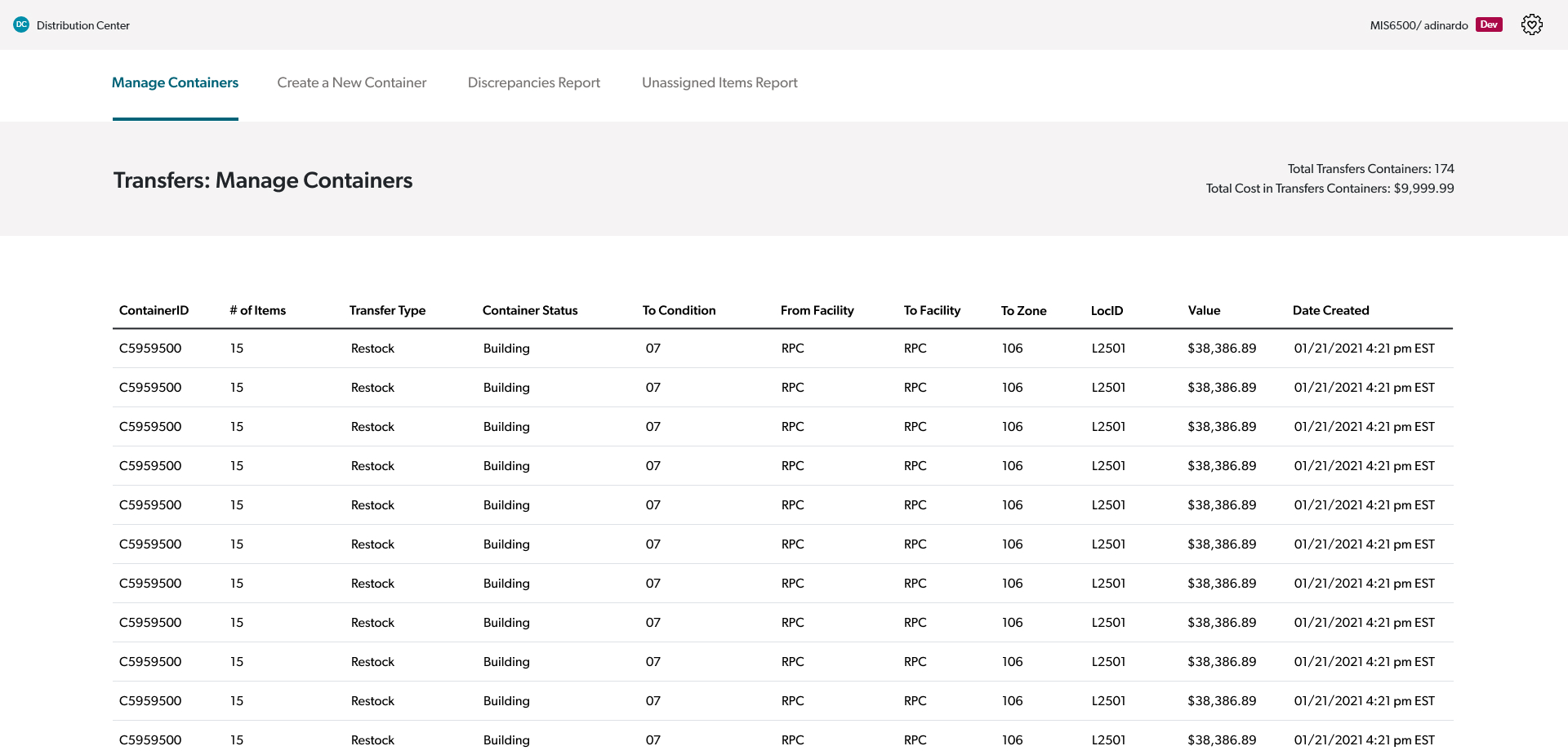
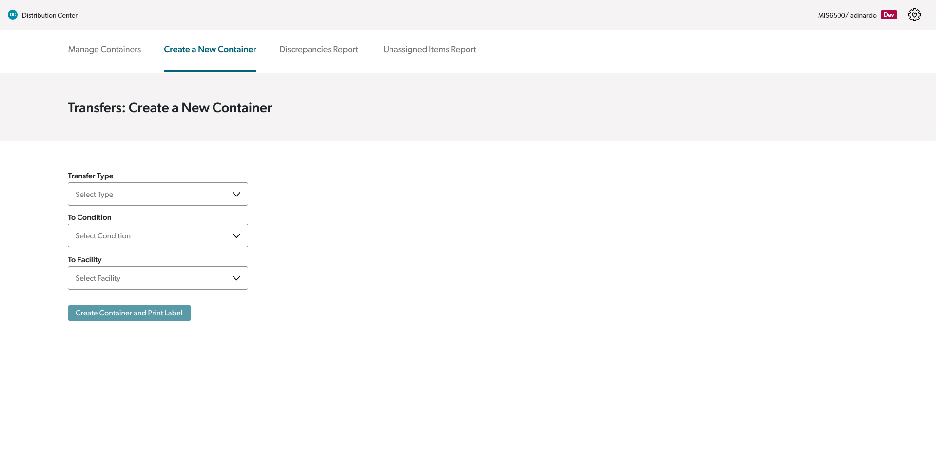
The Transfers web app is used to transfer and track items throughout Crutchfield’s two warehouses. Prior to this web app, inventory handlers were using a combination of desktop apps and Excel spreadsheets to accomplish this work. At the start of the project, my role on the team was as a UX designer, but a few months in, I took on the role of agile coach in addition to UX designer. Since wrapping up the MVP1 work shown here, my team has added features to the app in order to continue improving the experience for our users, and we also designed and built a scanner gun app to work hand in hand with the web app.
At the beginning, the team met with stakeholders and project managers in an effort to understand how their current process worked. In order to harness the knowledge of those who were already familiar with the warehouse processes coming into the project, we diagrammed how items move through the warehouses, both when ordered and returned.
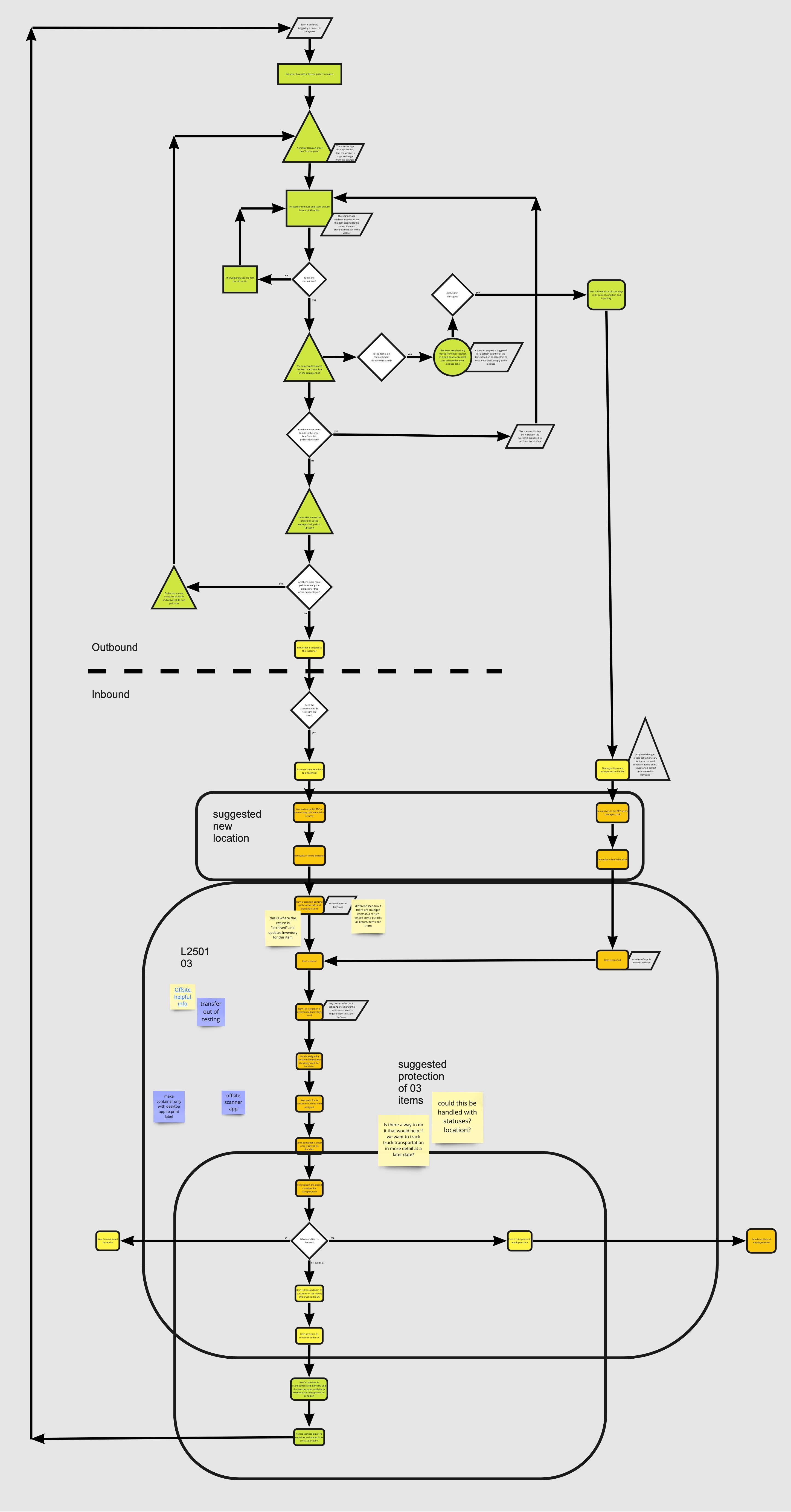
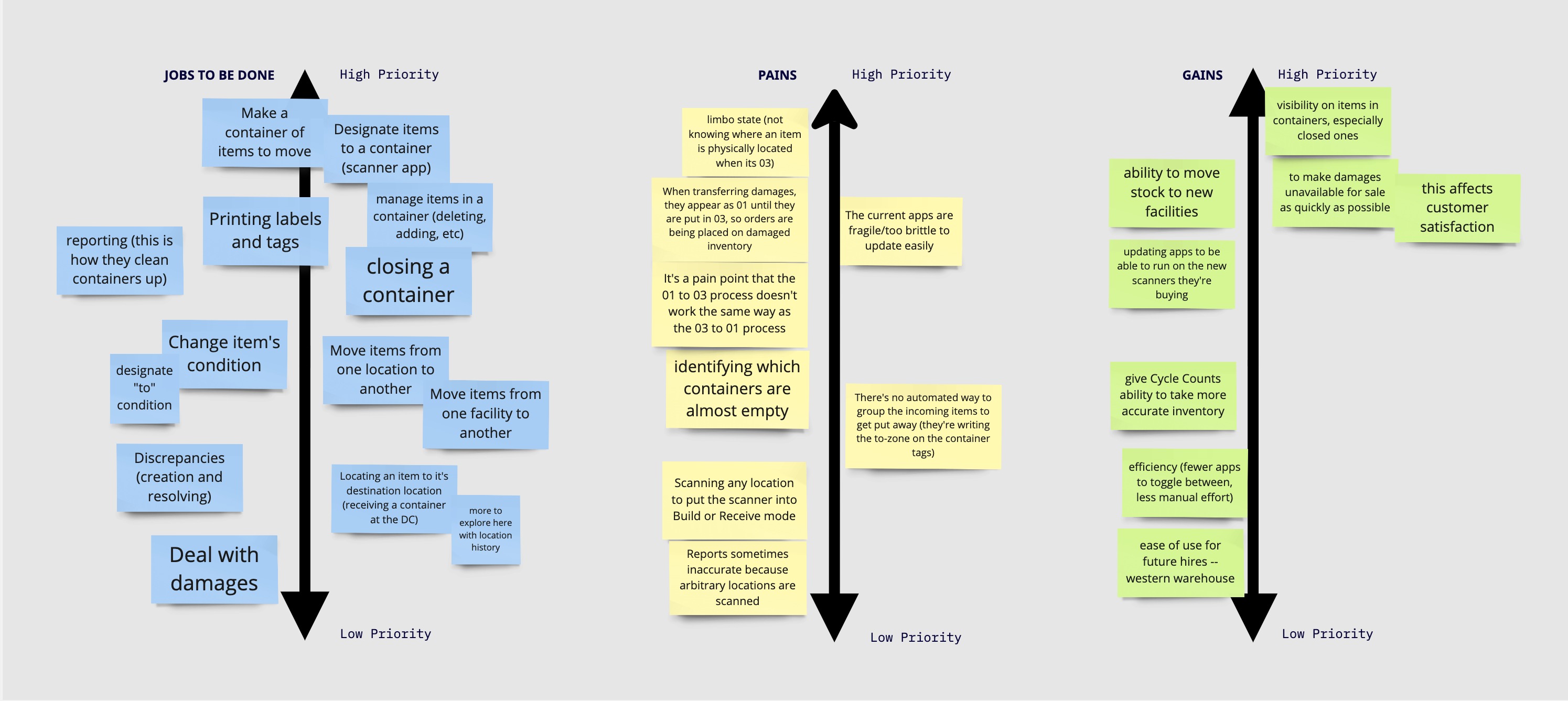
We then used this diagram to identify jobs to be done, pains, and potential gains.
From here, we started napkin sketching together as a team, quickly envisioning different directions we might take to minimize the identified pains and optimize the potential gains all while keeping our users and the jobs they need to accomplish in mind. I then translated these napkin sketches to prototypes, which my manager and I took to the warehouse to do user testing with in the environment the web app would be used in.
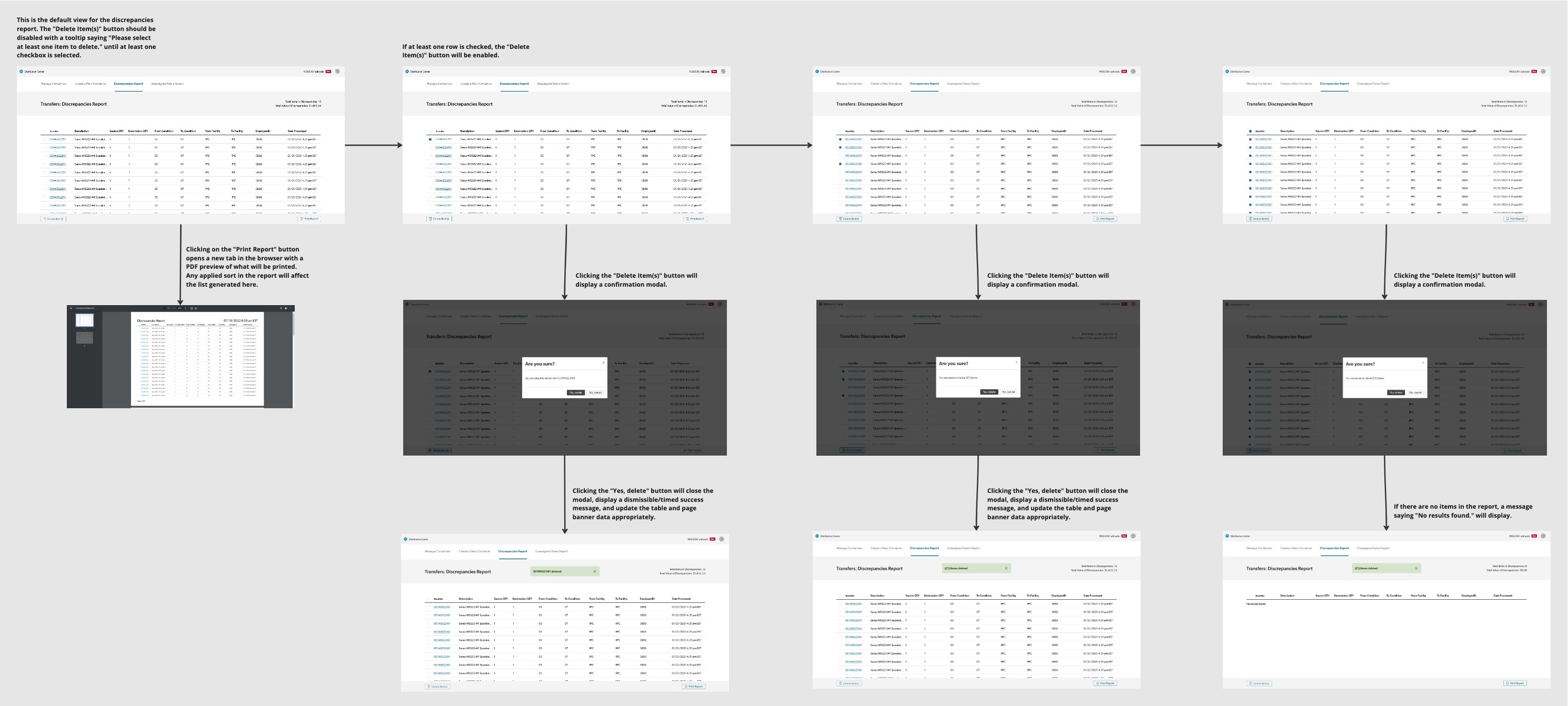
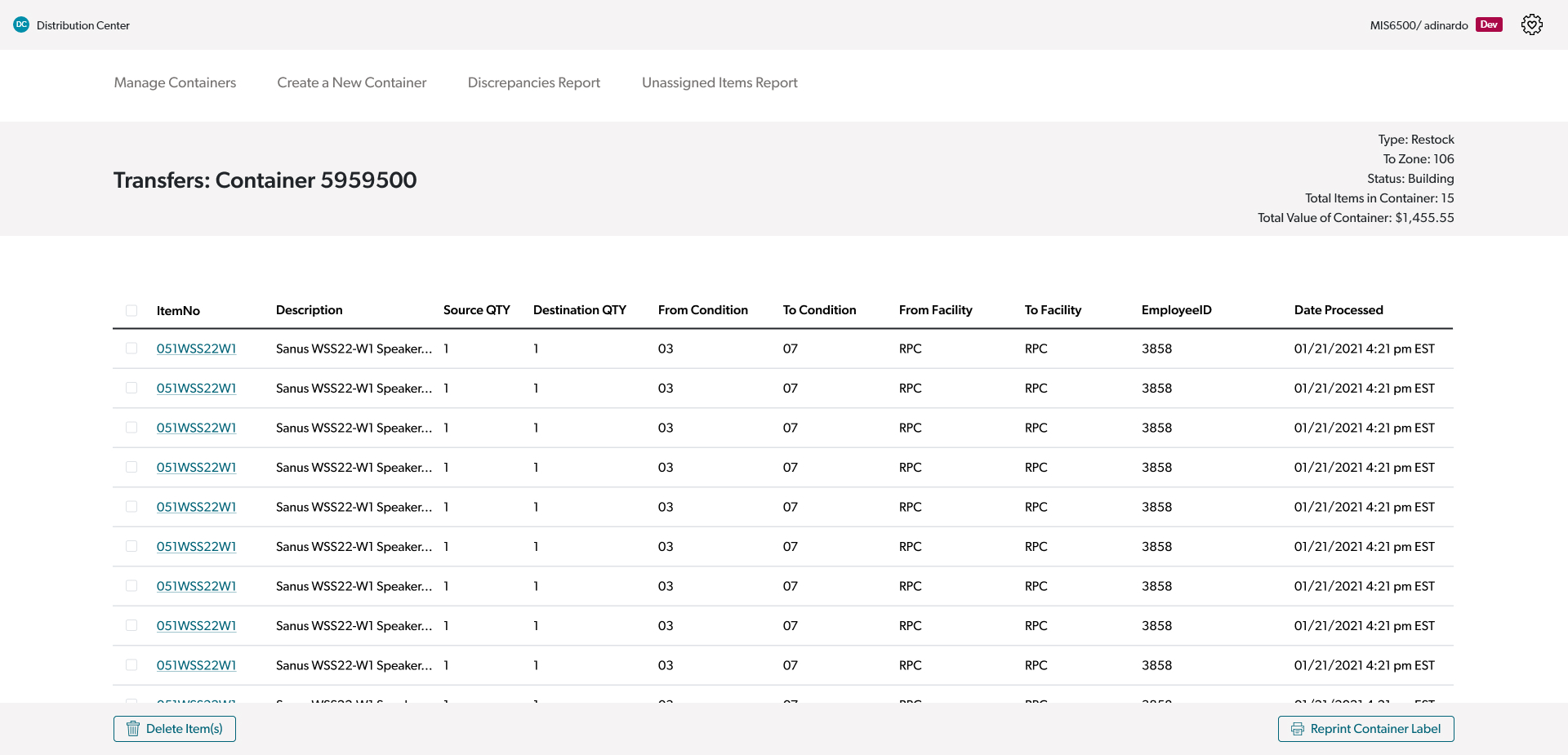
We gained valuable feedback from our users through user testing. Knowing that our users were internal Crutchfield employees who would become powerhouse users of the app through daily use, we had assumed it would be a good idea to save screen space by having inline actions represented by icons on each row of the tables. However, we did not realize until we saw our users interacting with the prototypes in their environment that they stood while doing their work and were farther away from their screens than anticipated. Due to this, we adjusted our direction to have a checkbox on each item in the tables that when checked, enables corresponding action buttons in a sticky footer. To aid in handing off the prototypes to the developers, I diagrammed out the possible scenarios for each page in Miro. An example can be seen below.
