Crutchfield Account Creation
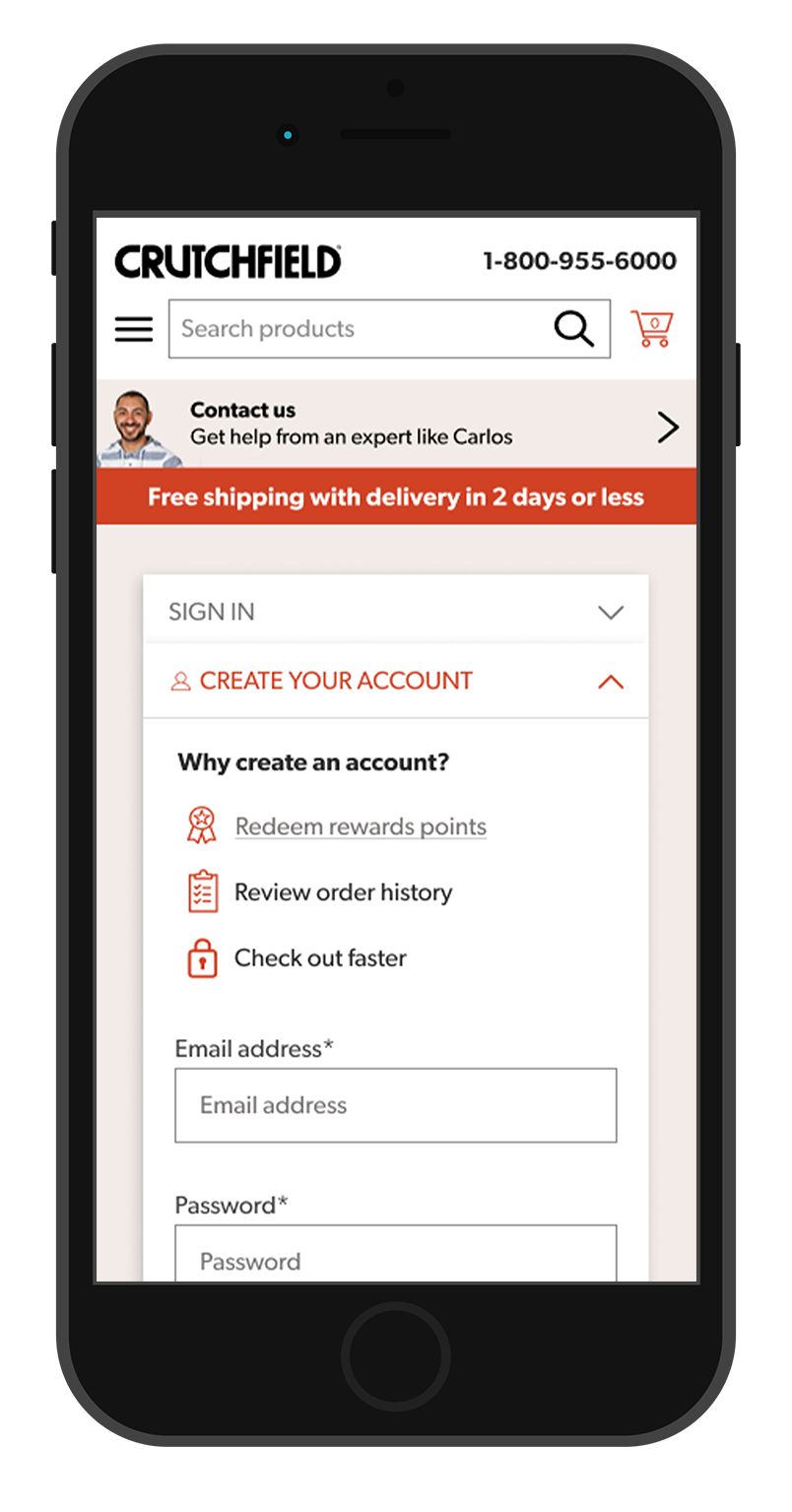
During the course of a project geared toward improving Crutchfield’s refer a friend feature, user research revealed a steep drop-off of users in the funnel at the point of account creation. Although this is to be expected to some degree, through this project we sought to lessen that drop-off. Our intuition started us in the direction of improving this problem by providing users with reasons why creating an account benefits them, and this intuition was confirmed by secondary research. The scope of the project did not include a full page redesign, so for the first round of prototypes I focused on following the guidelines from my research to include graphics alongside short lines of text.
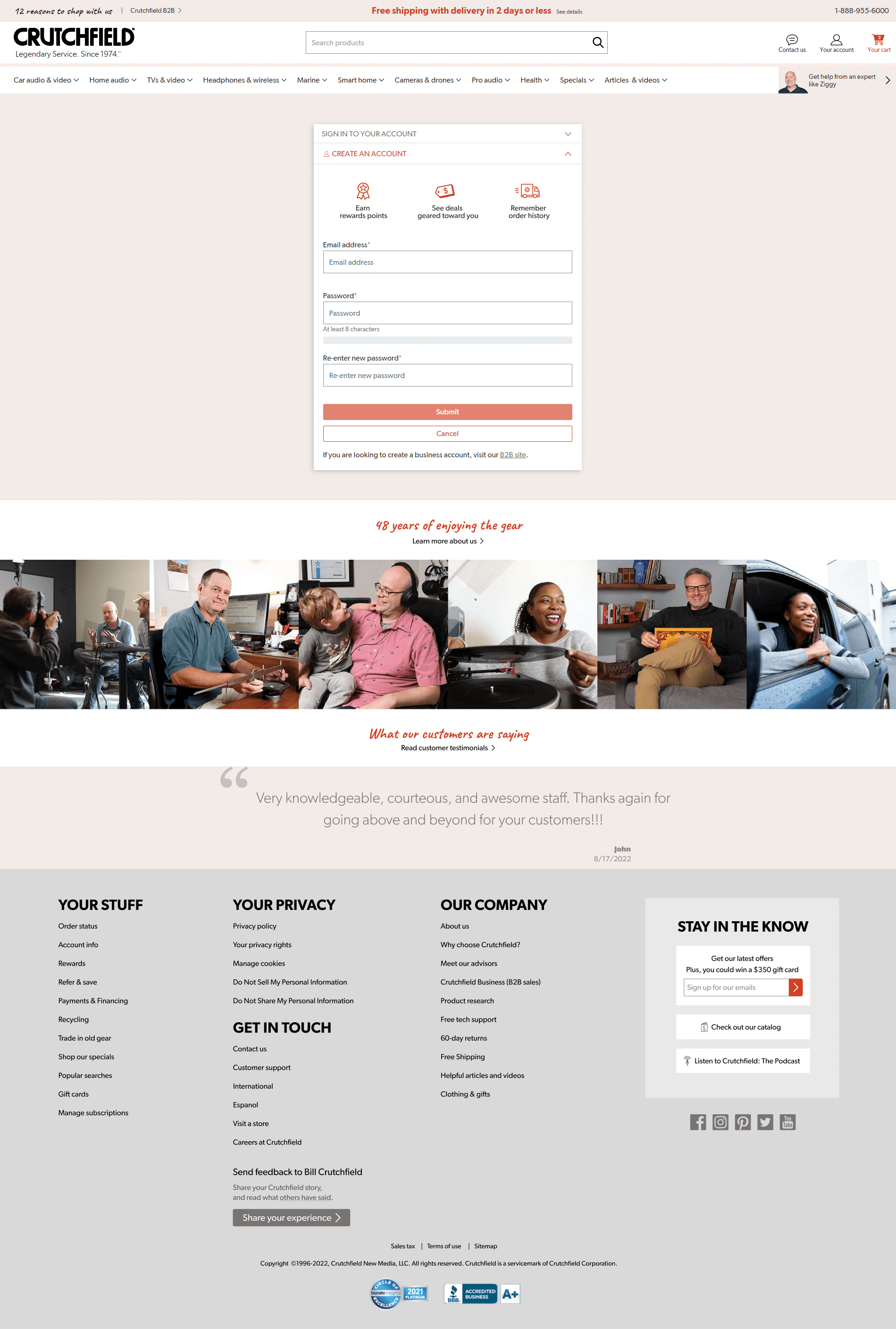
On showing stakeholders this first round of prototypes, their gut reaction was that they wanted an easy way for users to learn more about Crutchfield’s rewards program so I iterated through options such as this one with an accordion to collapse and expand the rewards details in an effort to keep the beginning of the account creation form above the fold on mobile.
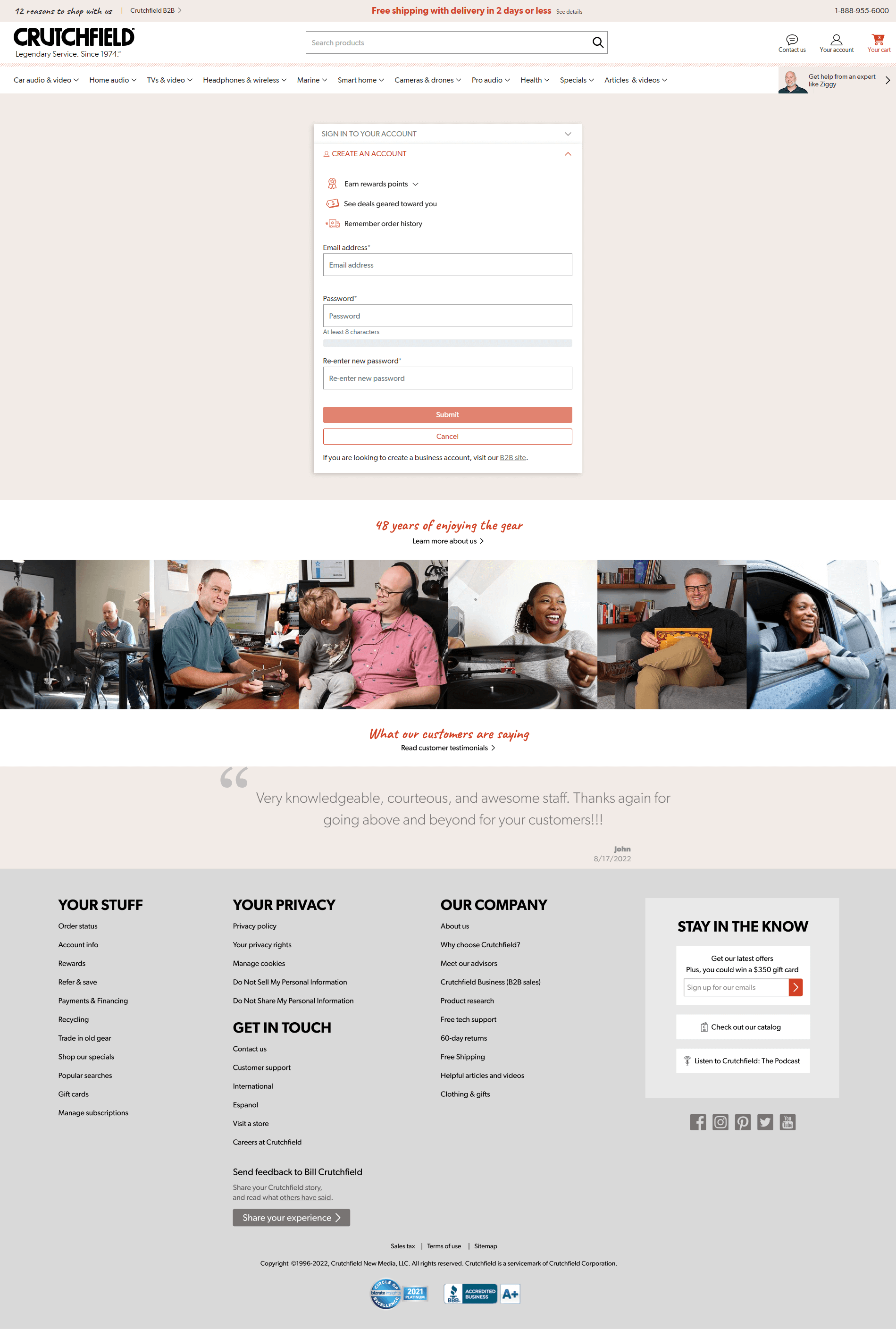
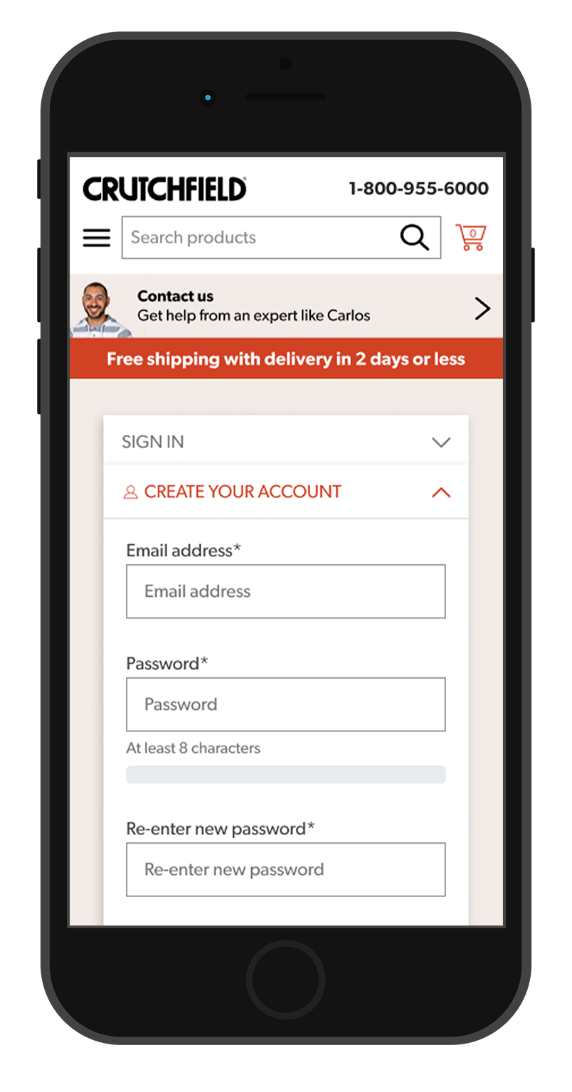
For the final design, we decided to link the rewards language to Crutchfield’s rewards page. The first image below shows what account creation looked like before this project, and the second image shows the changes implemented for this project, which I helped my team's front-end developer code.