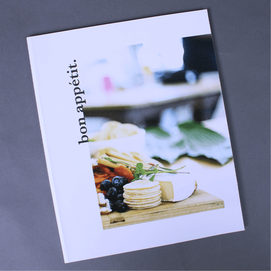
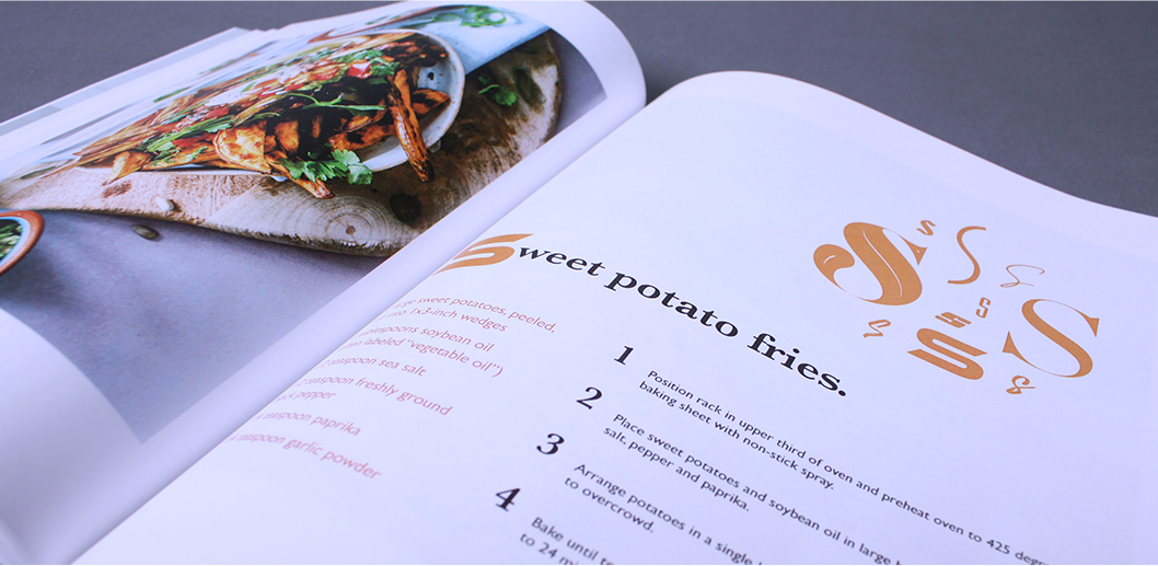
Type Spec Book
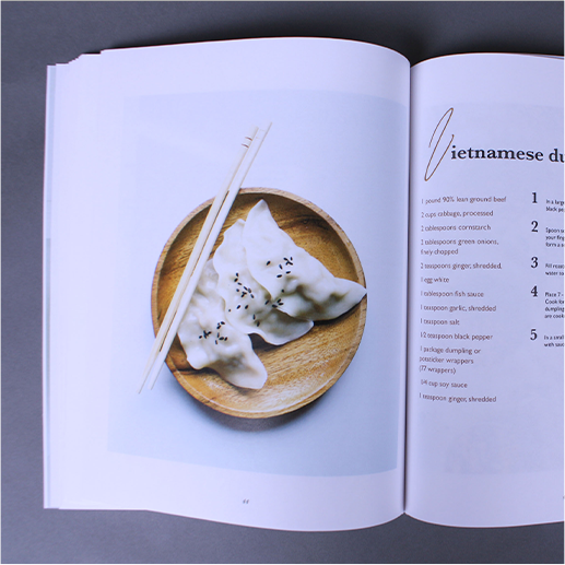
The goal of this project was to creatively display ten instances of each letter in the alphabet. Each spread had to tie in to the overall theme, so I chose to design a cook book containing recipes from A to Z. I wanted the book to feel classy and refined, and this desire guided my design choices including the minimalistic cover, ample white space, and prominent photography.
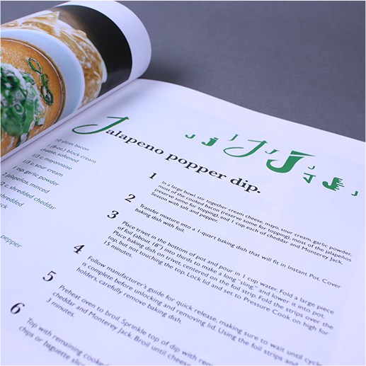
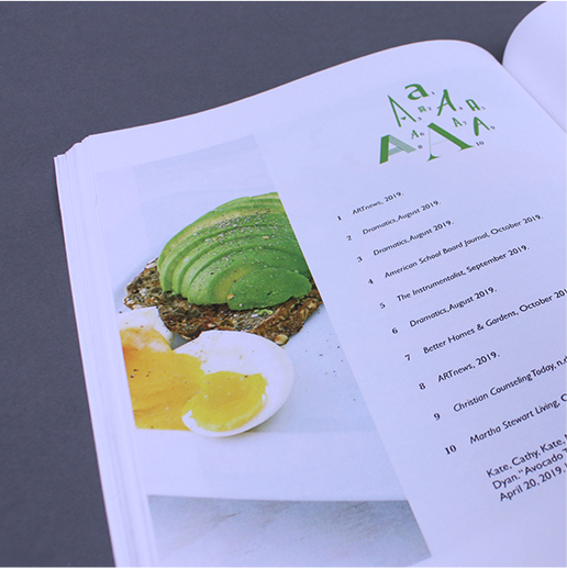
One of the challenges I faced in completing this project was how to tie the typographic elements in with the rest of the design. In my first rounds of design, each spread looked relatively the same. Although I had the general framework down, it was missing the final touches to give it the right balance between unity and variety. Receiving critique helped me solve this problem and resulted in taking visual queues from the images on each spread and reflecting the elements of color and shape in the corresponding composition of letters.