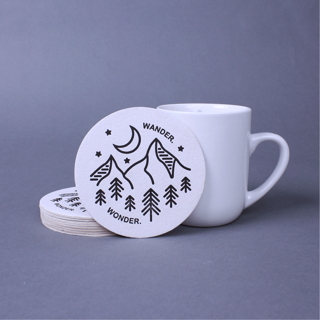
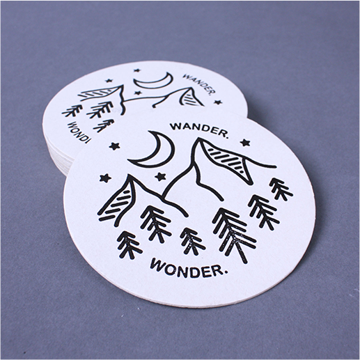
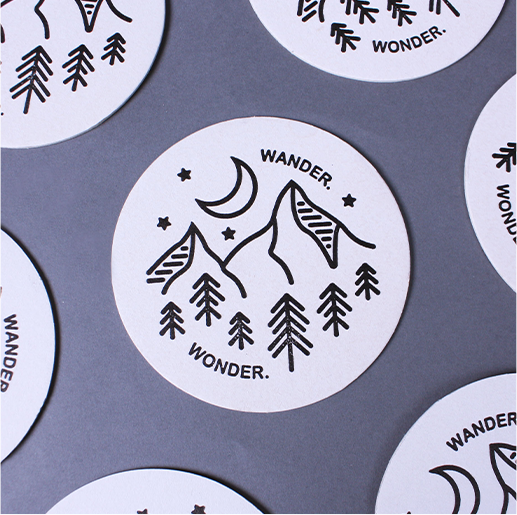
Letterpress Coaster
These coasters were a fun exploration into letterpress printing. Although in most printing the goal is to have as polished a look as possible, letterpress printing allows for a little more personality with its slightly uneven inking and tactile feel from being pressed. I decided to mirror this personality in my design. The illustration and letters reference cartoon style illustrations with their rounded edges, and the wording choice of "Wander. Wonder." came from a folk song by The Arcadian Wild.
The main problem to overcome in this project was refining both the thickness of the letters and lines so they would not run into each other from ink bleed. It was interesting having to keep variation in mind when designing a project for print. I mostly think of this as a problem in web design, but the variation adds to the final product as each coaster is unique.